
Restructuring a Financial Reconciliation Platform
OVERVIEW
Evencard was a financial reconciliation platform focused on card transactions.
I joined as the company’s first Product Designer during a period of rapid growth. The platform was business-critical but highly complex, built on a monolithic architecture, and marked by inconsistent interface patterns.
I led the restructuring of the product experience by redefining the information architecture, creating a design system, and simplifying key user flows.
During the process, I balanced the long-term vision of expanding into an omnichannel solution with short-term improvements to the legacy system after the company’s acquisition.
As a result, we reduced churn, lowered support tickets, and delivered a clearer, more consistent, and scalable experience.
ROLE & DURATION
Senior Product Designer
Mar 2021 - Dec 2022
Context
When I joined Evencard, the product was already live and serving an active customer base. It had been built by the founding developers and evolved quickly based on individual client requests.
Each new request was implemented and released to all customers without broader validation. Over time, this approach resulted in a product that worked, but became increasingly complex and difficult to navigate, especially for new users.
Most customers were small and medium-sized business owners looking for clarity around incorrect transaction fees. Instead, they faced a platform that required significant effort to learn and configure.
During the pandemic, the company also identified an opportunity to expand beyond card reconciliation into delivery apps and, later, other sales channels.
The challenge was clear: simplify the existing experience while preparing the product to scale.
Key Problems Identified
Sistema Legado - Antes:
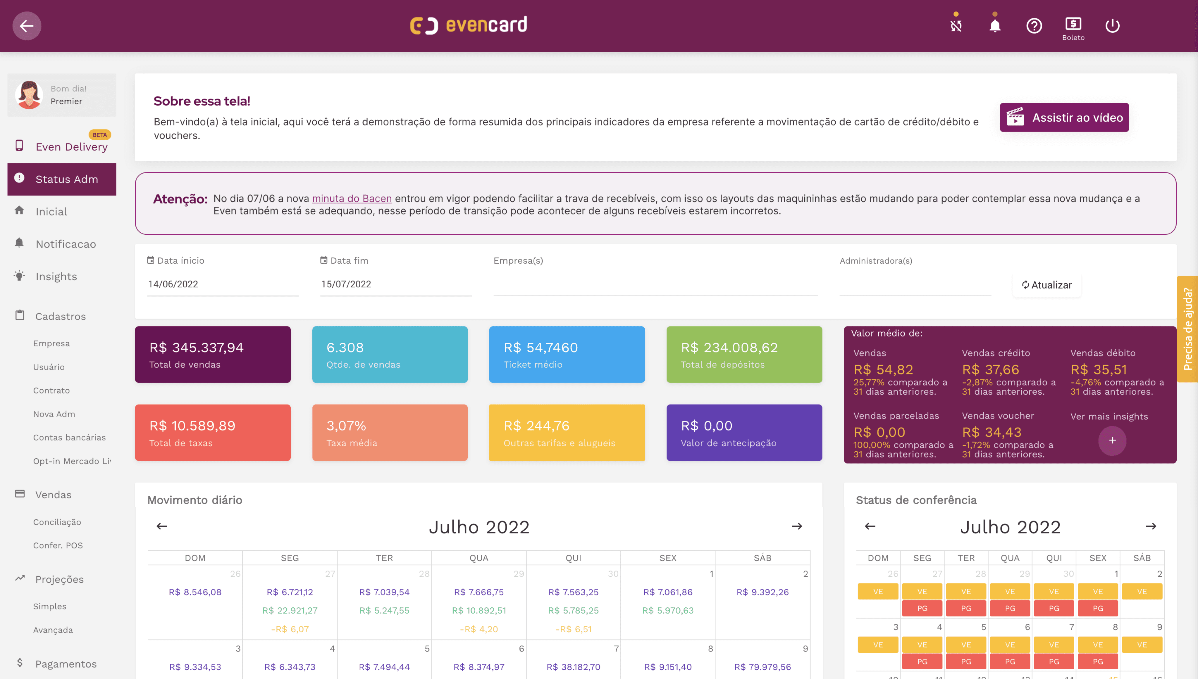
Through heuristic evaluations, user interviews, and contextual observation, we identified the following patterns:
Inconsistent interface, with no clear visual or structural standards
Too many features and reports, with no clear information hierarchy
High cognitive load, requiring training sessions of up to 3 hours
Confusing initial setup flow, where manual fee configuration triggered false audit alerts during first use
Monolithic architecture, that limited evolution and scalability
As a result, many customers signed up for the platform but never fully adopted it.
The issue was not a lack of features, but excessive complexity for a user base with limited time.
My role
As the company’s first Product Designer, I led the transition from a reactively built product to a more structured approach focused on user experience and scalability.
My main contributions included:
Redefining the information architecture
Restructuring the core user journey
Establishing visual and interaction standards
Creating and documenting a design system in Figma
Validating strategic decisions with customers
Collaborating with engineering on user stories and technical decisions
Supporting the integration with the iFood API
Temporarily taking on PM responsibilities during transitional periods
Beyond UX and UI execution, I actively contributed to product decisions and, at times, took ownership of prioritization and backlog organization.
Strategy & Product Vision
The initial analysis showed that the core issue was not missing features, but a lack of structure.
We defined three strategic directions:
1. Reduce Complexity
Eliminate redundancies, reorganize the information hierarchy, and simplify critical user flows.
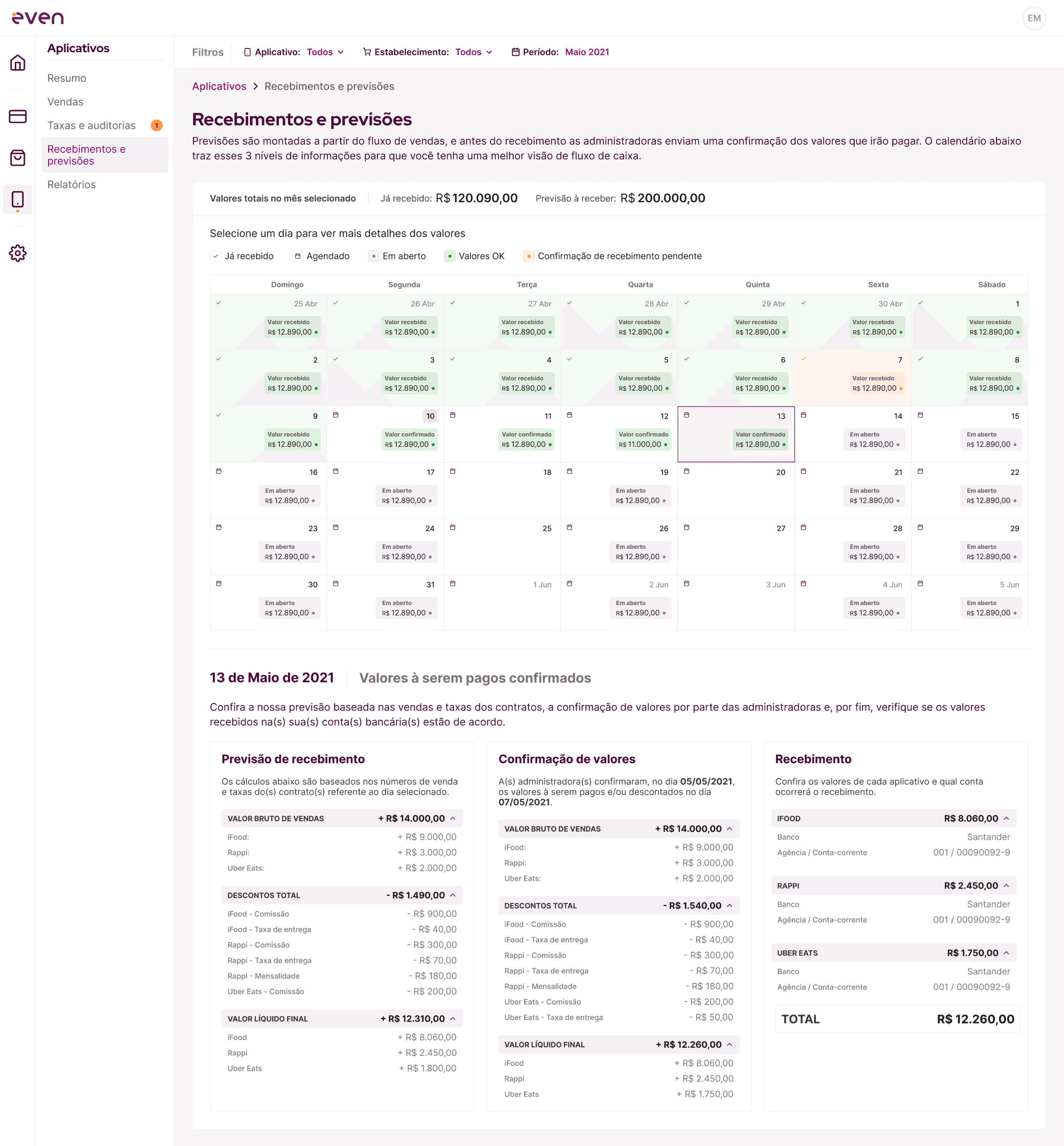
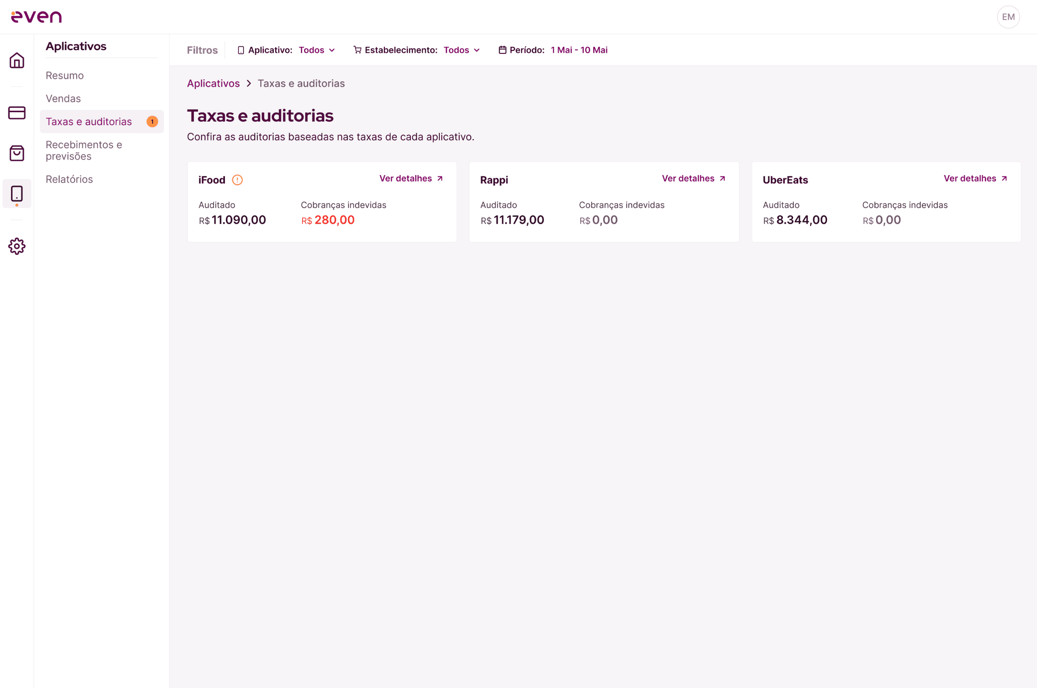
2. Structure the Experience into Three Core Areas
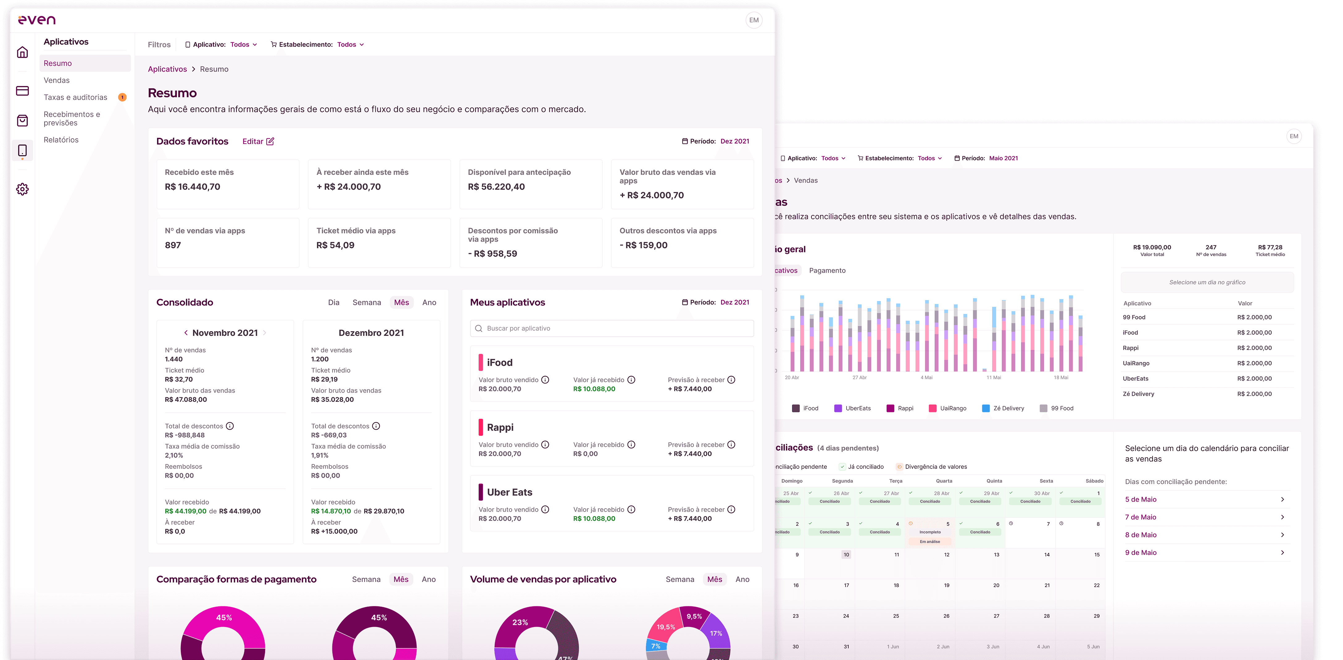
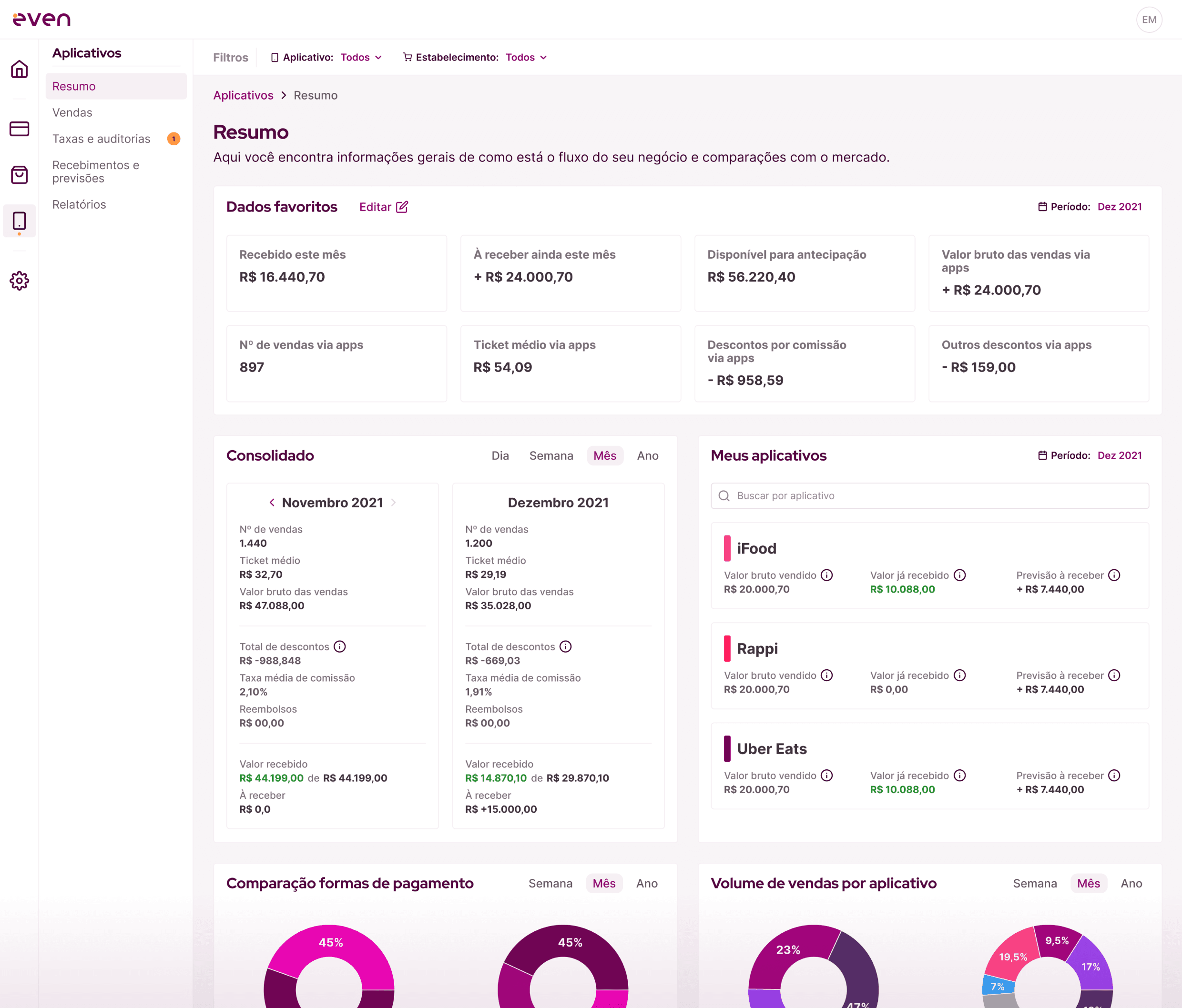
We reorganized the product into three independent core areas:
Sales
Audit
Receivables & Forecasting
This structure improved functional clarity and supported future expansion, allowing users to focus on the functionality most relevant to them.
3. Prepare for Scalability
Establish the design system before development
Rebrand from Evencard to Even
Plan integration with multiple sales channels
Beyond improving usability, the goal was to build a sustainable foundation for growth.
Building the New Platform
With the strategic directions defined, we began building a new foundation for the product.
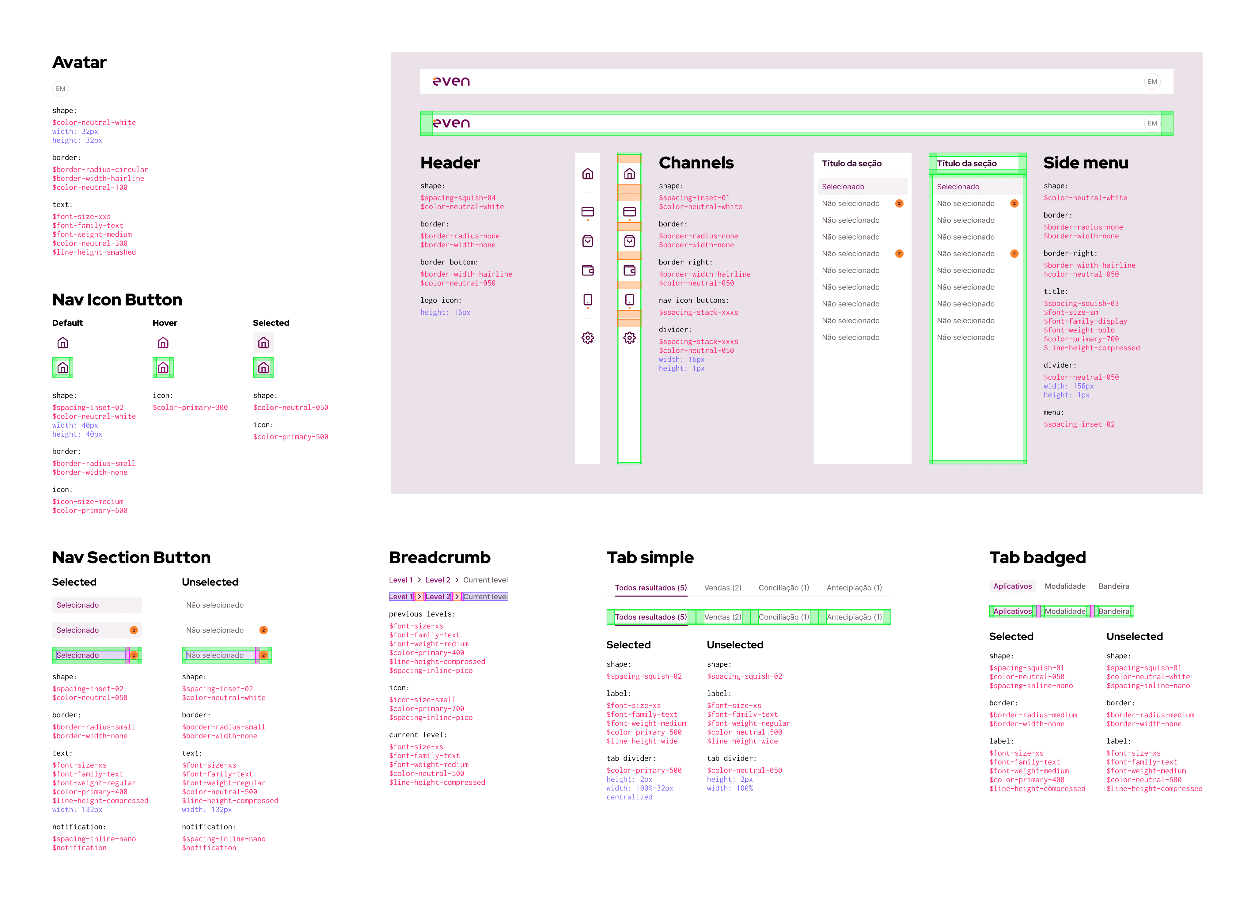
Before development started, I created a structured component library in Figma, defining:
Visual and interaction standards
Reusable components
Typographic hierarchy
Color and spacing tokens
Consistency guidelines across modules
Design Tokens Documentation:
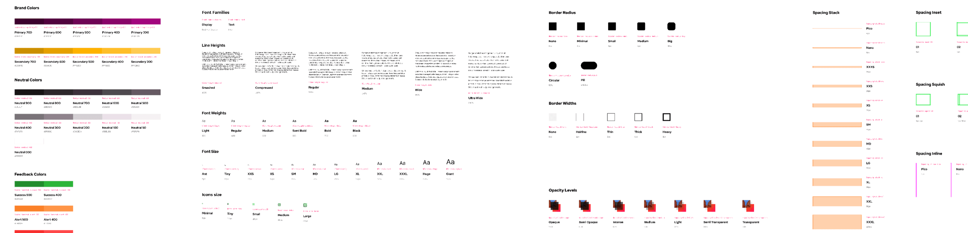
Component Documentation:
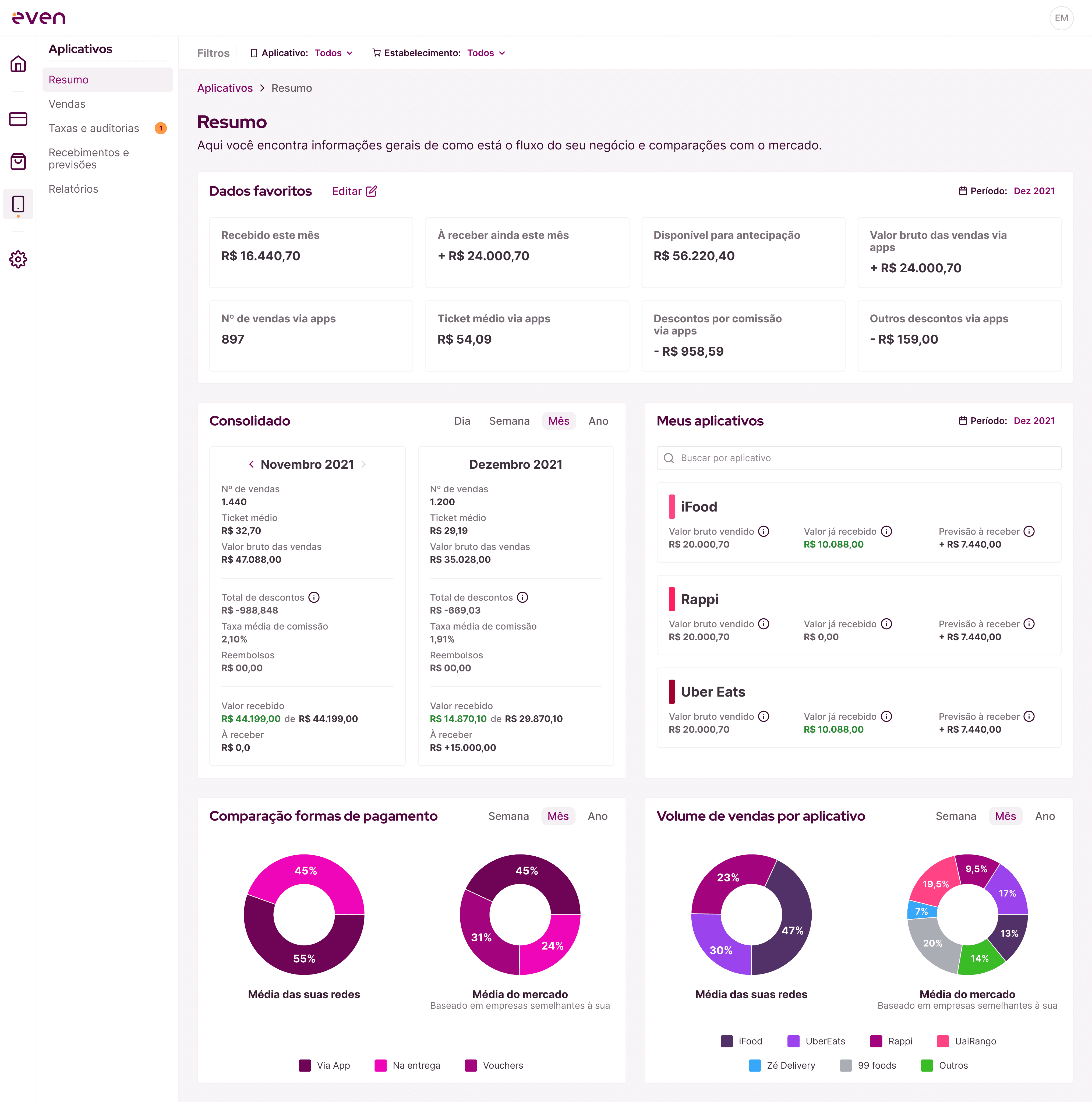
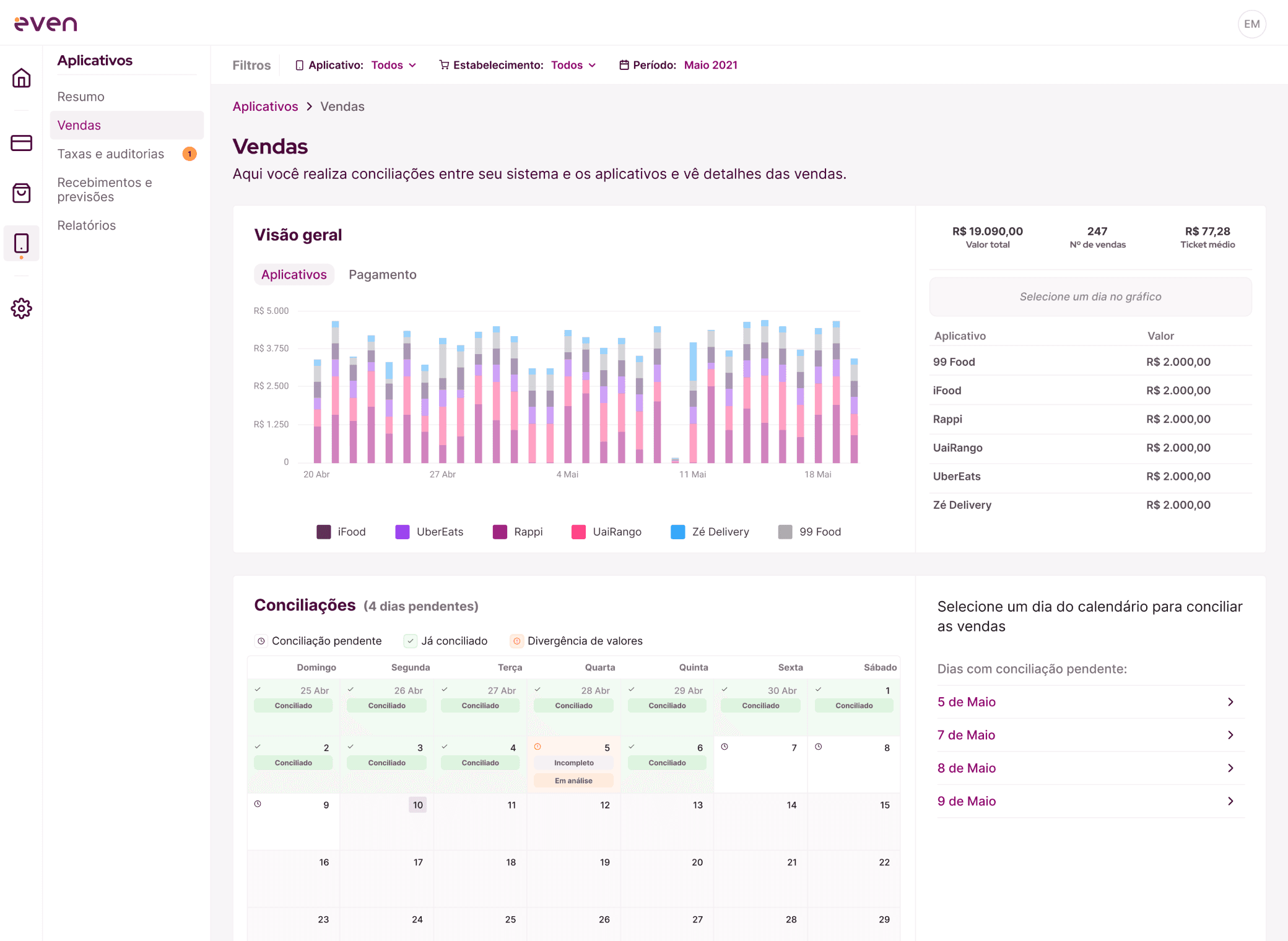
In parallel, I developed high-fidelity prototypes for the main user flows, based on the three defined pillars, and conducted validation sessions with customers.
Development & Beta
With the new squad in place, we began developing the refactored platform. In the first half of 2022, we launched a beta version focused on iFood reconciliation.
The beta prioritized:
Read-only experience
Simplified navigation
Modular structure
Minimal and standardized interface
We worked closely with four active beta testers during this phase.
Resultados da Fase Beta
Noticeable reduction in navigation complexity
Positive feedback regarding information clarity and organization
More consistent delivery between design and engineering
However, data inconsistencies affected trust in the platform, and it is a critical factor for financial products.

PLOT TWIST → Acquisition & Strategic Shift.
In 2022, the company was acquired and went through a merger, adopting the Liber Capital brand.
With the new organizational structure, priorities shifted:
Development of the new platform was paused
Churn became priority
An increase in support tickets was impacting the operations team
Legacy system inconsistencies were affecting retention
We decided to redirect our efforts toward immediate improvements in the existing legacy system, applying the structural principles we had already defined.
Legacy System Redesign
With the new platform development paused, we shifted our focus to generating immediate operational impact.
We used frameworks such as the Opportunity Tree to prioritize initiatives with the highest potential impact on retention.
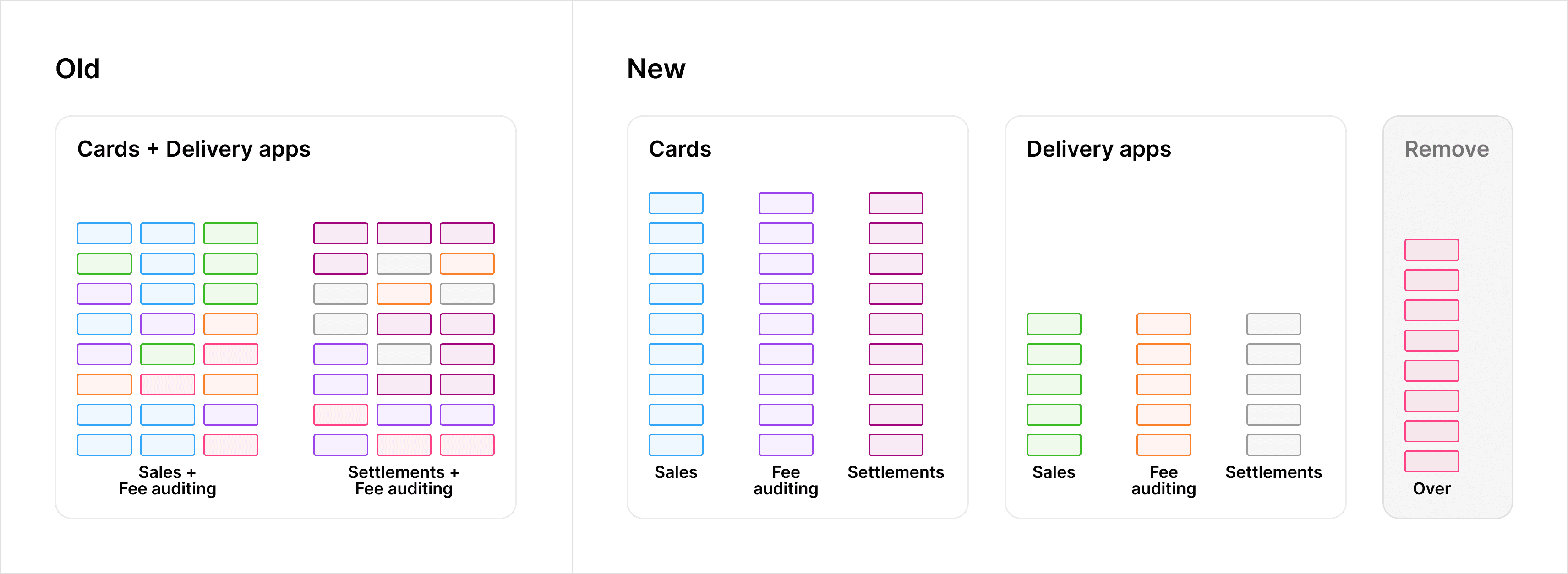
We applied the validated concepts from the new platform to the legacy system:
1. Information Architecture Reorganization
Reduced the number of reports
Logically grouped related features
Simplified navigation
2. Flow Simplification
Removed redundant steps
Improved the fee configuration process
Activated auditing only after full setup completion
3. Visual Standardization
Applied the Liber visual identity
Gradually implemented the newly defined design standards
The goal was not to rebuild the system, but to reduce friction within its existing architectural constraints.
Legacy System - Before:
Legacy System - After:

While the updates significantly improved usability, minor visual inconsistencies remained due to the structural limitations of the monolithic architecture.
Resultado e Impactos
Após 3 meses da implementação:
↓ 18%
Support tickets
3h → 50min
Training sessions reduced
↓ Fluxos e conteúdos
Significant reduction
5% → 4%
These changes improved operational efficiency and helped customer retention.
Learnings
This project reinforced two fundamental lessons:
1. Clarity on the Impact of Each Delivery
Not every initiative needs to solve the entire structural problem. I learned to clearly define the intended impact of each phase — whether validation, simplification, or short-term retention.
2. Balancing User-Centered Design and Business Priorities
The best user experience solution is not always the immediate strategic priority. I learned to balance usability decisions with operational sustainability, aiming to create impact on both the user experience and the business.
This balance was key to the product’s evolution and to my growth as a strategic product designer.
Product Continuation
After restructuring the main platform, we developed a Lite version focused on accessibility and faster adoption.
Let's connect
Get in touch for opportunities